


HAPPY NEW YEAR.....2009
architecture NOW
Wednesday, December 31, 2008
Tuesday, December 30, 2008
New Olympic Ski Jump in Garmisch


Architects: terrain: loenhart&mayr
Location: Garmisch-Partenkirchen, Germany
Architects in Charge: Prof. Klaus Loenhart and Christoph Mayr
Project year: 2008
Complete Complex Lenght: 395 meters
Structural design and structural planning: Mayr | Ludescher | Partner, advisory engineers, Munich
Design and planning of jurybuilding, technical equipment: Architects Sieber+Renn, Sonthofen, Germany
Photographs: terrain
The Olympic Ski Jump in Garmisch-Partenkirchen is one of the most renowned facilities of its kind, having hosted the New Year ski jumping competition as part of the international Four Hills Tournament for 55 years. Now, after the advance premiere in January 2008, the new Olympic ski-jumping sports facility, designed by the young Munich ofce of Prof. Klaus Loenhart and Christoph Mayr, terrain: loenhart&mayr architects and landscape architects, will be ofcially opened in December of this year.
Due to a required upgrade of the jump to the advanced technical standards of the International Skiing Federation (FIS), the construction of an entirely new ski jump was inevitable. Among projects by Zaha Hadid Architects, Behnisch Architects and others, an international architectural competition in autumn 2006 led to the decision to erect a cantilevering structure as the new landmark of ski sports in the valley of Garmisch-Partenkirchen. In the course of designing the ski jump, the terrain:loenhart&mayr ofce drew inspiration from the local topography of mount Gudiberg. The connecting lines of the new ski-jumping facility are an interpretation of the gentle curved lines of the outposts of the chain of mountains. Through its integrative and linear aesthetics of undulating lines, the new design of the jump ties in separate functional entities, including delivery and access points, to form a dynamic landscape-building unit. As much the goal was to develop a topographically rooted architecture for the new Olympic skijumping hill, it is meant to work in a dialectical mode: Topographic integration links up with sculptural expressiveness, giving the new jump in Garmisch-Partenkirchen its unique characteristic appearance. At the same time, its architectural impression and formal dynamics also invites associations with the risk and acceleration of the ski-jumping sport. The quest to overcome gravitation, inherently linked with ski jumping, is architecturally expressed by the cantilevering inrun of the ski jump. In the more than 100-metre-long inrun structure, athletes, coaches, press representatives, and visitors can walk up the 332 steps of the “Jacob’s ladder” to arrive at the three competition decks.
Alternatively, and less strenuously, the decks can also be accessed with the newly developed diagonal elevator. Athletes have nicknamed the new facility the “Olympic Cantilever”. The design of the inrun track is also a novelty. The jump is virtually independent of the weather in winter due to its minimal snow volume requirement and energy demand. Thanks to the additional thermoplastic track, the jump can be used in summer without having to be converted.
The entire inrun structure is covered with translucent polycarbonate elements whose appearance changes with the daylight and respective lighting. During the day, the new jump forms a harmonious unity with the surrounding snowcovered landscape. Light and shadow on the white panels establish a suggestive relationship with the surrounding winter landscape. After sunset, the artifcial light illuminates the architectural body from inside, turning the cantilevering building into an illuminated sculpture that is visible even at great distance in the valley of Garmisch-Partenkirchen.
source: www.archdaily.com
architecture NOW
Saturday, December 27, 2008
Guangzhou Baiyun International Convention Center / BURO II + CITIC
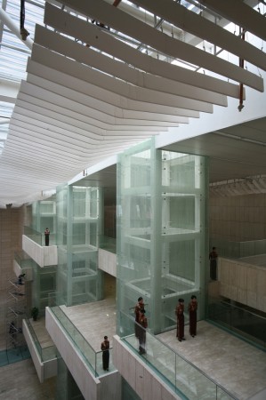
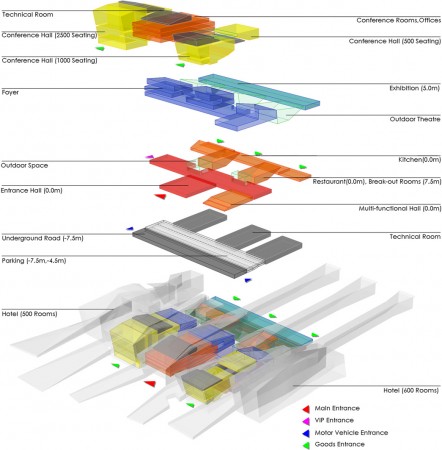
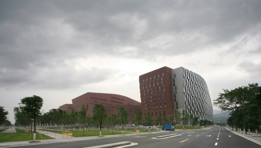
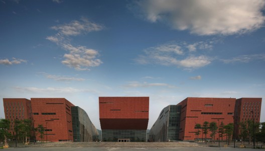
Architects: BURO II & Design Institute of China CITIC
Location: Guangzhou, China
Structural Design : Laurent Ney & Partners (Belgium)
Landscape Design: Stefaan Thiers en Denis Dujardin (Belgium)
Facade Engineering: Van Santen & Ass. (France)
Interior Design: Lens°Ass (Belgium)
Project Year: 2007
Photographs: Philippe van Gelooven
This project recently won the civic category at the World Architecture Festival
The local authority of Guangzhou decided to develop a congress centre at the edge of the historical landscape of the Baiyun Mountains. The new congress centre will function as generator for the further urban development of the city of Guangzhou.
The congress centre is integrated in a system of physical and visually open connections between the city and the mountains. The primary principle is the merging of landscape and building. The ‘fingers of nature’ penetrate the site; the mountains are brought into the city.
The concept is an open modular system of flexible spaces. Functions are grouped through the horizontal and vertical modulation. The horizontal modules house general services, foyers, catering exhibition space, VIP areas, offices… The vertical modules are meant for specific facilities, including a congress hall for 2500 people.
source: www.archdaily.com
architecture NOW
Friday, December 26, 2008
Block 16 / René van Zuuk Architekten


Architect: René van Zuuk Architekten
Location: Stadshart Almere, Koetsierbaan, the Netherlands
Client: Ontwikkelingscombinatie Almere Hart c.v
Program: 49 apartments and commercial space
Design Team: René van Zuuk, Kersten Scheller
Project Team: Björn Ophof, Marieke van den Dungen
Structural Ingeneering: Pieters Bouwtechniek Delft b.v.
Project Year: 2005
Site Area: 1,650 sqm
Constructed Area: 8,740 sqm
Photographs: Christian Richters
Block 16 is part of the master plan designed by OMA for a new prestigious city centre in Almere. The autonomous expressive block reacts on two conditions: the billowing end marks as a kind of gatekeeper the harbour entrance. At the other end the movement is smoothened and the building fits in with the right-angled grid of the adjacent glass high-rise housing blocks. The block is sited on a basement car park (design OMA) serving as a pedestal. The elevated deck level is half occupied by the common entrance and the storerooms. The other part is a gym which continues on the parking level below where it ends in the fitness-café, an autonomous pavilion.
The design of Block 16 is largely based on an analysis of tunnel formwork constructions. Implementation of this mode of construction is financially attractive in developing major housing projects. The basic principle of tunnel formwork is the simultaneous casting of floors and party walls. Similar to extrusion techniques, this requires a constant section. It is common practice that the tunnels are also of a constant length, resulting in a regular concrete skeleton. Variation in the length of adjacent tunnels breaks the monotonous structure. The result is a wavy façade surface providing the block with a dynamic quality. This unusual application of tunnel formwork implies a relatively small rise of the building costs, but yields a much more expressive image.
Block 16 is equipped with two central corridors, providing the occupants’ access to the apartments. The living rooms of all the 49 apartments are south-facing and orientated to the waterfront. On the northern side of the block the private stairs are located interconnecting higher or lower floors. The main communal stairwell fills a seven-storey void located behind the biggest bulge. The deviant function is furthermore revealed in the exterior by the strip of half sized cladding panels.
The hollows and bulges in the façade all have a functional basis. The dimple on the north side marks the entrance and the protruding south façade arises from adding patios to some apartments.
Initially a wooden cladding was planned, but in the tenders submission it turned out to be too expensive. A new solution was found by manufacturing façade elements each covering an entire tunnel section. The intention was to apply the elements in a weatherboard manner, implying an overlap on all sides. This is only possible if the panels in the vertical direction shift sideways, resulting in an unwanted diagonal grid in the elevation. Because of the adapted application of the weatherboard principle, the sides of the panels do not fit. The remaining oversized ‘chink’ is sealed with a different material, separating the elements from each other. It provides the building with two faces; smooth and wavy in one direction, rough and staggered in the other.
The silver-coloured anodised aluminium cladding of the façade combined with the continuously changing incidence of light creates a varying identity of Block 16 and suggests a moving scaly creature.
source: www.archdaily.com
architecture NOW
Dell Children's Medical Center of Central Texas, Austin, Texas, USA, United States

Dell offers the first-ever look at a trend-setting hospital of groundbreaking aspirations.
Combined with a desire to celebrate the community and culture of central Texas in the U.S., the design for the hospital began with a distinct vision to significantly reduce or eliminate the negative impact of the building on the environment and building occupants. The facility is part of a 700-acre new urbanist development on the brownfield site of a former municipal airport in Austin, a city known for promoting green building practices. An on-site natural gas-fired energy plant; courtyards that provide natural light and cooler, cleaner fresh air; views and access to nature; and the use of environmentally-friendly finishes all contribute to providing central Texas with a unique healing environment that is not only appealing to patients and families, but plays a key role in recruiting and retaining employees, critical in an industry experiencing a shortage of skilled staff.
source: www.worldarchitecturenews.com
architecture NOW
Tuesday, December 23, 2008
Central Los Angeles Area High School #9, Los Angeles, United States


Design for High School #9 realised as building completes
The design by Austrian architects Coop Himmelb(l)au for the Central Los Angeles Area High School #9 for the visual and performing arts has completed and will open in September 2009 for the new term.
Central to the building is the suitably dramatic theatre which holds just short of 1,000 audience members and will be open to the public as well as the 1,800 students providing a public space which was previously lacking in the Grand Avenue area.
Each student is matriculated within one of four academies representing each of the arts disciplines, accordingly there are 4 separate classroom buildings as well as the theatre, the library and the cafeteria making up the seven building campus.
Coop Himmelb(l)au’s design concept is to use architectural signs as symbols to communicate the commitment of the Los Angeles community to Art. Like chess figures three sculptural buildings, which relate to the context of downtown Los Angeles and the program, redefine spatially and energetically the otherwise orthogonal arrangement of the master plan. A Tower figure with spiralling ramp in the shape of the number 9 located on top of the theater’s flyloft serves as a widely visible sign for the Arts in the city and a point of identification for the students. Inside the tower, an event, conference and exhibition space with a view across the city is planned to be located.
source: www.worldarchitecturenews.com
architecture NOW
PUMA City, Shipping Container Store


Our green friends over Inhabitat just tipped us on a new project by NYC/Napoli based office LOT-EK, a practice that has been doing an interesting job by reusing containers.
24 containers are put together to create a 3 storey store with over 11,000 sqf, including a bar/lounge area and 2 decks.
The store is currently at the Volvo Ocean Race 2008-2009, and it´s transported to each location (Alicante, Boston, Stockholm) and assembled quickly.
source: www.archdaily.com
architecture NOW
Museum of Contemporary Art Metelkova, Ljubljana, Slovenia


More culture for ex army barracks area
Architecturally challenging was the restoration of the protected historic structure of the ex army barracks area built in the 19th century which has served the military government in the past, and is intended to be used for art in the future providing exhibition, storage and office spaces.
The key purpose of the idea was not the art work itself but the observer and his reaction towards art placed in a public space in which he enters a scene of a play, a stage, where the variability results in new experiences and aspects of viewing.
It was never intended to define the added volume as a building in the true sense of the word - it's more like an artistic product, a hollow sculpture with a dynamic character, a »room« inside a big house representing the whole area of the Metelkova cultural center, therefore the borders between inside and outside are wiped out.
Looking for a fresh approach to classical elements, the design offers a new interpretation: six columns are replaced by vertical gaps sealed with a glass surface, the space in between is replaced by six repetitive vertical volumes of reinforced concrete.
Box is a synonym for the added volume of the museum/exhibition space. White colour stands for virgin coldness and is a metaphor for purity - fullness and emptiness at the same time. White colour transforms into light if we are thinking about the building as a spatial object, however if we are looking at whiteness as something two-dimensional - we observe the color.
The new facility is a combination of white and reality – realism and minimalism.
source: www.worldarchitecturenews.com
architecture NOW
H&M Store in Barcelona


Edtudio Mariscal did a complete work for H&M in Barcelona: Architecture, lighting, furniture, graphics… even the shopping bags.
Client: H&M
Architecture, interiors and graphic design: Estudio Mariscal
Location: c/ Portal de l’Àngel 22, Barcelona, Spain
Area: 1.720 m2
Year: 2008
Contractor: Dula Bau
Furniture and commercial equipment: Dula Ibérica
Structural engineering: nb35
Technical architecture and services: MC Arquitectura e Ingeniería
Leds (provider): BARCO
Leds (installation): SONO
Lighting: iGuzzini
Renovation: Artecc
Aluminium stairs: Alcan
Continous pavement: Pavindus
Furniture:
Personal Shopper area: Guitarra chair, by J. Mariscal for Uno Design
Noble room 3 Zodiac sofa, by J. Mariscal for Uno Design
Shop area, stools and seats Guitarra
Fitting rooms, stools by Estudio Mariscal for H&M
Sculpture: Taller de escultura Pere Casanovas
A design project aimed at creating excitement among the customers that go into the shop. Excitement at buying clothes and also to be shopping in a pleasant, comfortable, unique place. To make sure that the area is the setting for a pleasant, fun-filled experience. Second objective: that the clothes should find their own place, that the distribution of the shop should order the exhibition of the clothes and the routes. Design at the service of the shop’s activity, never the other way round.
The new H&M shop is found in the most commercial street of Barcelona, Portal de l’Àngel, in the building which was, until recently, the head office of the company Catalana de Gas. The original building, which is listed, is a vestige of the bourgeois architecture from the end of the 19th century, and is the work of Domènech Estapà, an architect who was opposed to the Modernista movement and more inclined towards a neo-classical style.
The fact that it is listed and the architectural style of the building were two premises that partly marked our project. The listing was, on the one hand, a real headache in complying with the heritage regulations. But, on the other hand, it was an opportunity to work on a space with noucentista proportions; from a time when square meters were not measured in terms of profitability, hence the huge staircase and the empty space that reaches up into the dome. A genuine old-fashioned luxury.
The change of use of the building was another conditioning factor for the project. We converted an area destined to be the offices of an important company into a modern clothes shop aimed, mainly, at young people, lovers of the latest trends. This meant approaching the project by trying to conciliate the “old” with the “new”. A remorse, bourgeois, baroque dialogue with a pop, modern, contemporary style.
We were very respectful with the different architectural features. We made a great effort to reform the building, highlighting the aspects which, over time and the different uses of the building in its latest stage, had been removed or altered. Things like the dome, the three public rooms, the staircase well and the imperial staircase.
We conceived an ephemeral interior architecture, composed of features that can be added and removed. A second exempt skin was superimposed on the old architecture, creating a new image, without blurring the original. This, which could have been an obstacle throughout the project, became an incentive as it finally helped us to achieve a multipurpose space which is flexible, modular and versatile. The objective, at all times, was to order the product to show H&M collections in the best possible way, which is why the second skin is neutral, in black and white.
The building is so large —1,720 square meters— that we tried to flee from monotony so that the new layout would have rhythm. Not just a rhythm in the formal aspect, but also in the intensity with which each area is experienced. To achieve this, we prepared surprises, changes of atmosphere, each with its own personality, different from the previous one. In this way, the route is more dynamic, as each corner creates expectation. Our aim was to add a “plus” of excitement and emotion for H&M customers.
We used pieces of puzzles to achieve an open design, which creates disparate situations that resolve, invade or colonise each corner of the space. To create furniture that responds to this modular need, we used metal that is superimposed and contrasts with the original wood and stone.
This shop was also conceived as a laboratory. It is a flag ship, an insignia shop. A logistical laboratory in which we studied how to make a storeroom that would enable the rails to be continuously restocked. We also concentrated on on how best to display the clothes. We investigated new ways of showing them and making the most of them. Shelves, rails and hangers, modules, Meccano ceiling fittings were designed bearing in mind the various sizes of the garments and the H&M accessories.
In the entrance, we started an explosion of light, colour and movement, through the LED screens. This entrance works as a shop window, shop sign and access. The communication between the interior and the exterior, which normally happens through the shop window, in this case consists of a virtual shop window. The pedestrian street is a flood of people that the entrance to H&M absorbs like a vacuum cleaner. To respect the façade, a minimal logo was placed.
The three public rooms on the first floor of the building, which used to be the offices of the directors of Catalana de Gas, have been restored and are integrated into the shopping space, as they have been given a new use. In these three rooms, the contrast between old and new is more evident, as the wooden display cabinets, the chimneys and the original wooden dais have been preserved and share the space with the new metal furnishings.
The staircase and the dome are two very important features of the alteration. We have emphasised the stairwell, the emptiness created by the staircase. The new staircase that has been built is not as important as the stairwell through which the light from the dome that tops the building travels. This central atrium communicates the floors and allows the natural light to pervade the interior. The cone is a metaphor, a symbol of rising up into the heights, a spiral towards the sky to capture the light.
In the new basement, sculptural features are integrated providing colour and identity to the space. A series of cactuses, in organic shapes, upholstered in materials in bright colours spatter the area and give it character.
In addition to the interior design and the design of the furniture, Estudio Mariscal was responsible for the lighting and its image and communication.
It is important to recognise, in a project such as this one, the creative freedom that H&M gave us at all times and the cordial, fluent relationship we have had with the client during all the stages of the project.
source: www.archdaily.com
architecture NOW
Saturday, December 20, 2008
Food Container Remixed / Spacelab Architects


Architects: Spacelab architects - Luca Silenzi
Location: Fermo, Italy
Collaborators: Roberto Sargo, Zoè Chantall Monterubbiano
Structural Engineering: Giampiero Luzi
Technical Inspection: arch. Luca Silenzi, arch. Roberto Sargo
Contractor: G.I.L. Costruzioni, Porto San Giorgio (Italy)
Constructive System: Precast concrete + metal structure; custom made precast exterior enclosure panels
Project year: 2006-2007
Construction year: 2008
Site area: 7200 sqm
Constructed Area: 2600 sqm
Photographs: ©Luca Silenzi
From box to hypercube. This brand new commercial building is a part of a wider urban district planned from Spacelab Architecture since 2006 in the city of Porto Sant`Elpidio - middle Italy, in the course of completion. The client brief was to realize the maximum formal impact in the limits of precast construction and basic tipology dictated by the medium-commercial function. We intended this limits as an occasion to conduct the modular precast construction to new formal results.
Mixing two structural systems {precast concrete grid + metal reticular truss}, the box resulting from urban plan parameters {maximum surface and height} is made more complicated in the entrance side by a tridimensional prismatic intrusion in the original volume, distinguished by using glass and other traslucent materials in comparison to other opaque fronts.
The result is a distorsion of perception near the main facade overlooking the public space, inside a more basic/stereometric frame. The other sides are charaterized by a precast custom-made concrete envelope, which module is denied by a continue abstract texture visually connecting each panel to the contiguous. Windows are obtaided by subtracting material inside the texture pattern.
source: www.archdaily.com
architecture NOW
Friday, December 19, 2008
24 City, Chengdu, China


Modern Chengdu development focuses on youth market
Just seven months ago 4.8 million residents in China were made homeless and more than 69,000 killed by the Sichuan earthquake which measured 7.9 on the Richter scale. Less than three months later this devastation was overshadowed by an international force as the Olympics came to Beijing. Now though, as the dust has settled on both the earthquake and the Games, the rebuilding of a nation can start to be realised.
Chengdu was the worst hit city, being just 80 km away from the epicentre, but is now set to be the location of a new urban community, named 24 City, which will house 60,000 new residents. China Resources Land Limited as developer for the project have selected Callison to design phase one of the 3.3 million sq ft mixed-use project which will also include a 38-storey office tower and an indoor/outdoor retail center.
In an effort to encourage and provide for young professionals moving into Chengdu, (Chengdu is host to 16 degree level universities), Callison’s design provides for a youthful and uplifting lifestyle. This is a design for living, not for relief. A hybrid retail complex modulates indoor/outdoor shopping and entertainment among lush landscaping and expansive view terraces. There is even an indoor skating rink, an 8-screen movie complex and a supermarket in the lower level of the office tower. Restaurants and the public garden will remain open after the center closes, offering public events and providing night-time entertainment for residents and visitors.
While the complex will provide much needed housing in Chengdu and create a new wave of living quarter, it had been the subject of some controversy documented in a feature-length film by Chinese Director Jia Zhang Ke. '24 City', a documentary-drama filmed before the earthquake struck, tells the story of the lives of those who worked in the factory which was demolished to make way for the complex. “420” factory was once a military aeroplane engine plant but in more recent, peaceful times produced consumer goods. Its closure left many who worked there for decades out of work. Despite the controversy the project is set to go ahead and design development will be completed by Callison before the Chinese New Year. Ground-breaking is scheduled for March 2009.
Niki May Young
News Editor
source: www.worldarchitecturenews.com
architecture NOW
Newman University College, Birmingham, United Kingdom

Masterplan for 'best UK University College' won by Glenn Howells Architects
Glenn Howells Architects (GHA) have been appointed by Newman University College Birmingham to develop the campus masterplan and associated buildings.
Newman was ranked as best University College in the 2009 Guardian University League Tables. A rapid programme has been agreed to deliver a new building which is designed to be an inspirational public face for the University, this will comprise an entrance building, library, family learning centre and crèche.
GHA are experienced in educational building and restoration being involved in the National Film and Television School in Beaconsfield, Aspex Gallery in Portsmouth and the Barber Institute in Birmingham among others. A planning application for Newman University College will be submitted in early 2009.
source: www.worldarchitecturenews.com
architecture NOW
Library and Learning Centre (LLC), University of Economics & Business, Vienna, Austria


Hadid wins with design for Library and Learning Centre in Vienna
Zaha Hadid Architects have fended off competition from international rival firms Morphosis, Studio Massimiliano Fuksas, Kada Wittfeld Studio and Prof. Hans Hollein to win the design competition for the University of Economics & Business's Library and Learning Centre (LLC) in Vienna.
A jury headed by Coop Himmelb(l)au's Wolf Prix chose the deconstructivist design by Hadid and her counterpart Patrik Schumacher, to take central place in the new campus masterplan designed by BUSarchitecture.
Described as a 'polygonal block' with 'both inclined and straight edges', ZHA's design statement for the LLC reads: "The straight lines of the building’s exterior separate as they move inward, becoming curvilinear and fluid, generating a free-formed interior canyon that serves as the central public plaza. All the other facilities of the LLC are housed within a single volume that also divides, becoming two separate ribbons that wind around each other to enclose this glazed gathering space."
The new 5-floor, 42,000 sq m LLC will house a learning centre as well as training rooms, admin offices, a library, clubroom, auditorium, book shop and ancillary service areas.
Cornelius Schlotthauer of Zaha Hadid Architects will see the project through to completion which is due by the end of 2012.
Niki May Young
News Editor
source: www.worldarchitecturenews.com
architecture NOW
Thursday, December 18, 2008
Timberland Westfield, London, United Kingdom

Wooden framing creates ambiance for popular clothing store
As part of the brief for their new store at Westfield London, Timberland challenged Checkland Kindleysides to bring the brand’s iconic tree logo to life and show their environmental values in action.
Taking cues from the Timberland logo and the dynamic tree-like roof supports which form the architecture of the centre, we created a lattice of reclaimed timber branches that wrap the store in the brand’s symbolic logo. The façade creates such a strong brand statement that the fret cut steel signage merely acts as endorsement that this is Timberland.
“This store provides a perfect example of what we stand for as a brand. It reflects our heritage in craftsmanship; our relationship to the outdoors; as well as our environmental values in action. The store front and ‘Market Place’ interior design represents Timberland’s iconic landmark in the retail world,”said a representative from Timberland.
source: www.worldarchitecturenews.com
architecture NOW
Lumen, London, United Kingdom

Lumen multi-faith church uses architecture and art for worship by all
Tavistock Place in London is famed for its Camden Town buzz, legendary bowling aisles and its proximity to some of the city's most famous nightclubs, but on July 7 2005 the street became infamous when it became one of the locations of the London bombings. It seems appropriate then that this is also the location for Lumen, a multi-faith church encouraging people of faith to worship together as one.
The centre is to open once again in the New Year following a modernisation which has seen Theis and Khan Architects collaborate with internationally renowned artists to create a place where worship is central to everything. The original church was built on the site in 1827 but was destroyed during the bombings of World War II. Following its rebuilding in 1965 the church required a modernization to complement the changing inner-city community for the 21st century.
There are three main elements to the redesign: a café clearly visible from the street through a dramatic 8m high window, a new sacred space for contemplation within the main body of the church and a new extension housing three community spaces.
Maggie Hindley, Minister, lumen comments: “We always worked with three aims: To put worship at the centre of everything; to create a ‘shop front’ and to partner with people of faith and with groups working for a better city.”
Commissioned by the United Reformed Church, lumen has continued the ancient tradition of commissioning artists and craftspeople. Working with Modus Operandi art consultants, the church has commissioned two artists to create new three dimensional art works, which are carefully integrated within the building.
Internationally acclaimed artist Alison Wilding has created a trio of artworks: a new font, a drinking fountain and a garden fountain. The sculptures, which explore themes of living water and light, create new points of stillness and reflection within the internal and external spaces.
The north window on the street front, features a spiralling, geometric sculptural screen, entitled North Elevation, by rising artist Rona Smith. Made of bronze, the sculpture is suspended within the alcove of the window, and arcs gently into the main space. The design evokes the traditional imagery of many religions, including Christian, Islamic, Hindu and Buddhist.source: www.worldarchitecturenews.com
architecture NOW
The O2, Dublin, Ireland

HOK Sport and Buro Happold designed venue opens in Irish capital
Following the success of the internationally recognised O2 arena in London’s Greenwich, the structure’s sister project in Dublin opens today. Telecommunications and investment company O2 enlisted the help of top stadium designers HOK Sport and international multi-disciplinary engineers Buro Happold to create an equivalent venue in the Irish capital city.
While the O2 arena in London’s canopy- form was an original design by Richard Rogers, refitted following its use as the Millennium Stadium by HOK SVE, the O2 in Dublin is an €80 million state-of-the-art renovation of the city’s historic Point Theatre.
The challenge was to provide a sustainable future for the venue by converting the interior hall into a unique elliptical amphitheatre auditorium, while retaining the essential features of the famous listed warehouse. John Barrow, Senior Principal at HOK Sport commented on the project:
“The architectural design is a response to the unique characteristics of the remarkable heritage building, the context of the new development and the unique opportunities and constraints of the site generally. The refurbishment and reuse of the historic warehouse as a public entertainment venue will have a considerable social impact on Dublin and we are confident that The O2 in Dublin will become a world class venue.”
The new auditorium has offers up to 14,000 seated and standing capacity, with retractable seating and screens offering the flexibility to create the right ambience for smaller events. The stage itself features exceptionally wide wings to accommodate a great variety of stage and sports events.
source: www.worldarchitecturenews.com
architecture NOW
Birmingham Magistrates Court design

Approval granted for Birmingham Magistrates Court design
International architects Denton Corker Marshall have been granted planning approval for another new major court building in the UK - the proposed new Magistrates’ Court in Birmingham. The practice was recently nominated for the RIBA Stirling Prize with their Manchester Civil Justice Centre.
The proposed Birmingham Magistrates' Court's design is comprised of 24 court rooms plus ancillary accommodation for staff, judiciary, witnesses, defendants, legal professionals and members of the public totalling approximately 20,600 sq m over 13 levels. The 24 courtrooms will be located on levels one to six with four courtrooms per floor. General administration and the judicial accommodation will be located on the upper four floors of the building. These will wrap around a central internal atrium to create a dynamic and interactive working environment.
Describing the design, Director Barrie Marshall commented:
“The building is closed in a single curvilinear silver metal ‘gown’ from ground to roof level. Into this surface, a series of irregular horizontal slotted and stepped cut-outs provide daylight to courtrooms and public consultation areas. At court level translucent white glass-clad boxes containing consultation and magistrates’ retiring rooms cantilever beyond the curvilinear surface reflecting the rectilinear nature of the internal planning and offering a more complex external reading of the building form.
“We wanted to give it an expressive and special character, so by creating a singular sculptural curved form that is perforated and punctuated, it becomes a more civic gesture in the company of the commercial and residential buildings that surround it."
The new building will be located close to the city centre and will provide a landmark within the Masshouse Masterplan. The new court building is required to replace the existing Magistrates’ Court accommodation within the Victoria Law Courts (VLC) and it is intended that construction will commence before the end of 2009. The VLC is a Grade 1 listed building that will be retained by Her Majesty’s Courts Service (HMCS) and refurbished through a separate project once the new building has been completed.source: www.worldarchitecturenews.com
architecture NOW
Green Void / LAVA
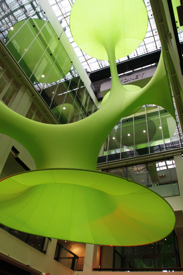
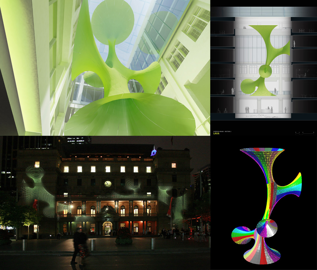

Architects: LAVA - Chris Bosse, Tobias Wallisser and Alexander Rieck
Location: Sydney, Australia
Project year: 2008
Project Team: Chris Bosse, Tobias Wallisser, Alexander Rieck
Collaborators: Jarrod Lamshed, Esan Rahmani, Kim Ngoc Nguyen, Anh Dao Trinh, Erik Escalante Mendoza, Pascal Tures, Mi Jin Chun, Andrea Dorici
Materials: Specially treated high-tech Nylon and light
Area: 300 sqm
Volume: 3,000 sqm
Photographs: LAVA
Digital Workflow
The project renounces on the application of a structure in the traditional sense. Instead, the space is filled with a 3-dimensional lightweight-sculpture, solely based on minimal surface tension, freely stretching between wall and ceiling and floor.
The design and fabrication procedure uses state-of-the-art digital workflow; beginning with 3D computer modelling, that is engineered structurally before undergoing a process of computer controlled (CNC) material cutting and mechanical re-seaming.
The computer-model, based on the simulation of complexity in naturally evolving systems, feeds directly into a production-line of sail-making-software and digital manufacturing.
The product shows a new way of digital workflow, enabling the generation of space out of a lightweight material that requires minimal adjustments onsite to achieve a complete installation in an extremely short time.
Sustainability
LAVA’s process of optimized minimal surface design and CNC (computer numeric code) fabrication technology allows the sculpture to reveal a new dimension in sustainable design practice.
Fulfilling the sustainable agenda of the venue, the work succeeds in its quest for optimum efficiency in material usage, construction weight, fabrication and installation time, while at the same time achieving maximum visual impact in the large atrium space.
The pavilion is easily transportable to any place in the world; can be quickly installed, and is fully reusable.
Fabrication
The sculpture materials consist of a double stretch, 2 way woven fabric that is mechanically attached to specially designed aluminium track profiles. Each profile is suspended from above, and to the side, on 2mm stainless steel cabling.
Concept
Since the 1970’s, with Frei Otto’s soap-bubble experiments for the Munich Olympic Stadium, naturally evolving systems have been an intriguing area of design research; something that hasn’t been lost on the team and their fascination with new building typologies and naturally developed structures.
concept image
The installation is a ‘Minimal Surface’ that consists of a tensioned Lycra material, digitally patterned and custom-tailored for the space. Five sides of the sculpture reach out to carefully hover just off the main interior atrium of the Customs House above the model of the city.
The lightweight fabric design follows the natural lines, contours and surface-tension of the fabric. The curves can be seen as the result of invisible bubbles that are translated into an organic 3-dimensional space.
While appearing solid, the structure is soft and flexible and creates highly unusual spaces within customs house, which come to life with projection and lighting.
Rising up to the top level restaurant, a vertical distance of almost 20m, the sculpture provides an intense visual contrast to the beautifully restored heritage interior of Customs House.
undefined
The Customs House ‘Media Wall’ is also activated with content detailing the process of design, engineering, fabrication and installation of the sculpture along with the impressive, recent design projects completed by LAVA across 12 video screens.
The whole installation is immersed in a soundscape by sound artist David Chesworth and graphic design by TOKO, and includes the latest 3D works by visual artist Peter Murphy.
source: www.archdaily.com
architecture NOW
Subscribe to:
Posts (Atom)


